
Devlog
Making a Color Puzzle Easier to See, Hear, and Control
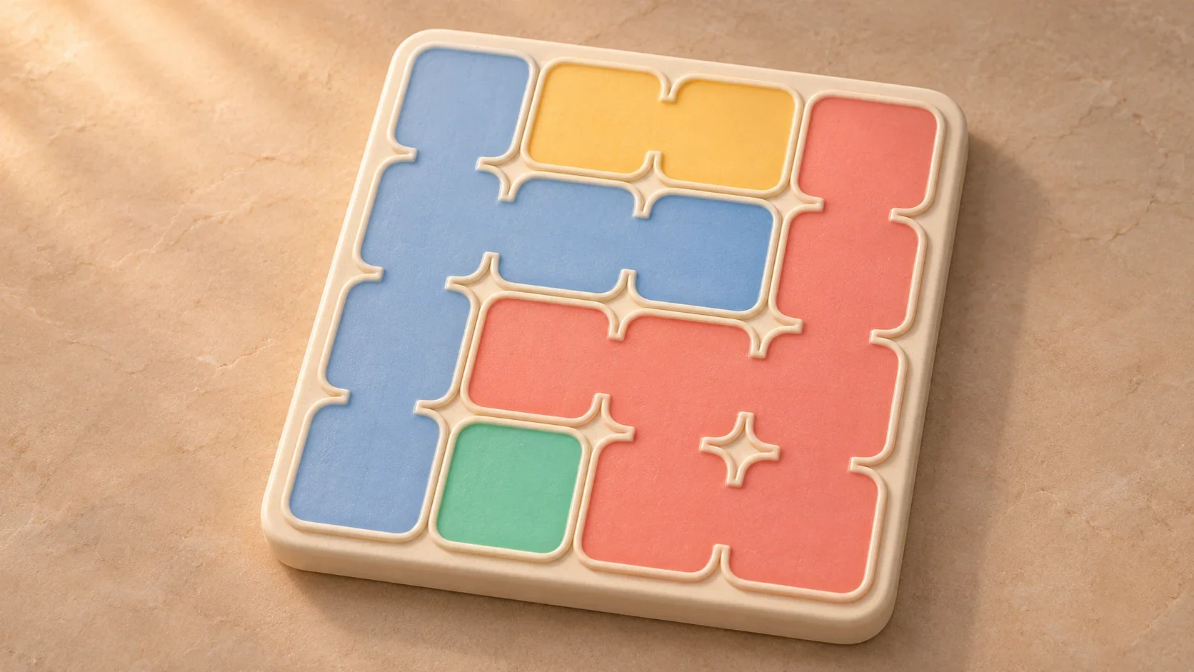
A puzzle should make you think about the next move. Working out which squares belong together, waiting through an uncomfortable animation, or fighting a gesture should not be the difficult part.
Yodoku asks you to place one lantern in each row, column, and colored region, without letting lanterns touch. That makes the presentation part of the rules: if two regions are hard to distinguish, the player is missing information they need to solve the board.
Building accessibility into this game has meant working across two layers. Flame draws and animates the board. Flutter supplies the surrounding interface and the accessibility tree. Both need to describe the same puzzle, accept the same moves, and respect the same settings.
This is a look inside the game’s current development code, including a less obvious problem: an accessible label can be perfectly readable and still reveal something it should not.
Give each region a shape, not just a color
The setting called Color blind support connects neighboring squares within the same region. Instead of a collection of separately colored tiles, each region reads as a continuous shape. It is enabled by default, and players who prefer separate tiles can turn it off.
This gives the eye another way to follow a region. You can trace a boundary rather than repeatedly deciding whether two squares share a hue. The small preview in Settings changes immediately, so the choice explains itself before you return to the puzzle.
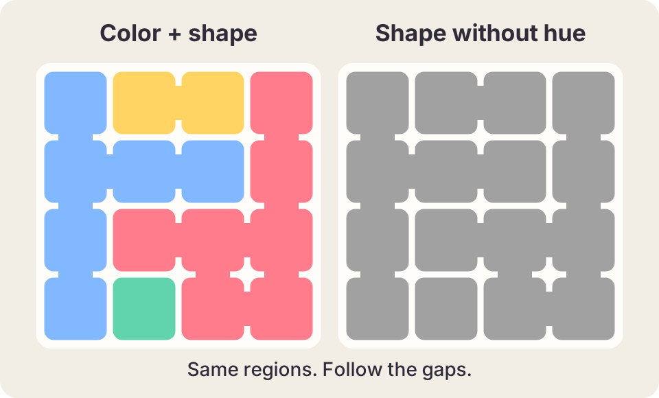
The geometry matters. Only orthogonally neighboring squares in the same region are joined. Two squares touching at a corner do not acquire a bridge, and an empty courtyard must stay empty. A decorative connection that crosses a region boundary would change the information the player sees.
The palette still does useful work. Its assignment tries to keep selected similar hues apart, including at diagonal contacts. Light and dark appearances have separate colors, and the dark-palette tests check a contrast ratio of at least 3:1 between tiles and the board surface, and between tiles and their marks. Those checks are narrow, deliberate assertions about this palette, not a claim that the whole game passes an accessibility standard.
Connected shapes reduce reliance on color, but they are not a substitute for testing with people who have different kinds of color vision. A grayscale view is a useful check that the shapes survive without hue; it does not simulate every way a person sees color.
A painted board needs an accessible interface
A cell drawn on a Flame canvas is not automatically a button in Flutter’s semantics tree. Adding one description to the entire board would identify the game without making it playable.
Yodoku puts a semantics-only grid over the rendered board. Each active square exposes its row, column, region number, and current state. An empty square can offer Mark with X and Place lantern. An X can be cleared; a lantern can be removed. An incorrect placement has its own description and cannot pretend to be an ordinary editable X.
The essential structure looks like this, with the state-dependent details omitted. Here, markAction and placeAction are custom semantics actions labeled “Mark with X” and “Place lantern”:
Semantics(
  label: 'Row $row, column $column, '
      'colored area $area',
  value: 'Empty square',
  onTap: markSquare,
  customSemanticsActions: {
    markAction: markSquare,
    placeAction: placeLantern,
  },
  child: const SizedBox.expand(),
)
There is no second game hiding in that layer. These actions go through the same input callbacks and tutorial guards as ordinary play. Focusing a square selects it without placing anything. Pausing the app disables its actions. Irregular boards expose only active squares, in row-major reading order, rather than asking a screen reader to walk through holes.
The focus rectangles come from the same measured board geometry as the Flame renderer. That is easy to overlook until the phone rotates: a correctly named button in the wrong place is still a broken interface. The tests compare those rectangles against the actual board in portrait and landscape, exercise marking and placement, and finish the first-session tutorial through semantic actions.
Touch instructions also need translation. “Double-tap to place” describes the game’s physical gesture, but a screen reader can give that gesture a different meaning. The accessible instructions instead name the Place lantern action. The goal is to communicate what the player can do in the interface they are using.
The region number that knew too much
While auditing the puzzles, a problem turned up beneath both the colors and the spoken labels. The generator’s internal region IDs encoded the solution row: region 0 contained the lantern for row 0, region 1 the lantern for row 1, and so on.
Those IDs were useful inside the generator. Exposing them as “colored area 1,” “colored area 2,” and so on gave a player an unintended clue about where each region’s lantern belonged. The preferred color order could carry a related cue. Making the numbers easier to hear had not made them safe to expose.
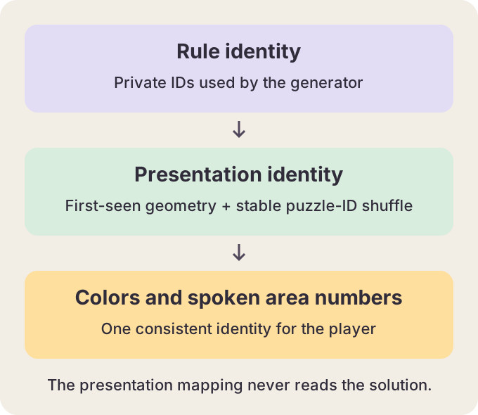
The fix separates rule identity from presentation identity. It first numbers regions by where their shapes are encountered on the board, then applies a stable, versioned shuffle seeded by the puzzle ID. It does not read the solution or the campaign position. Colors and spoken area numbers use that mapping, while the rules and saved puzzle identity keep their original IDs.
That distinction gives a useful test: rename every internal region without changing its shape, and the displayed identities should stay the same. Another test supplies a different valid solution for the same geometry and checks that presentation does not change.
This removes the guaranteed region-number-to-solution-row correspondence. It does not prove that colors contain zero statistical information: the palette still responds to neighboring shapes. The broader lesson is to audit every channel that describes the game. Text, sound, color, and accessibility labels all deserve the same question: what information are we giving the player?
Reduced motion should preserve the explanation
Yodoku’s Reduce motion setting uses shorter celebrations and still examples. The game also honors the device’s animation preference. If the device requests reduced motion, the app’s switch shows that the system setting is in charge rather than offering a contradictory override.
The policy is a simple logical OR:
final reducedMotion =
    userReducedMotion || platformReducedMotion;
Applying it is the larger job. The board settles its entrance and mark animations, skips the completion wave, and suppresses lantern particles. Settings transitions lose their movement. Tutorial and gesture examples show a settled state instead of continually replaying motion.
A still example must retain the result of the action. Freezing an animation at its empty first frame would technically stop movement while removing the explanation. In the gesture preview, reduced motion selects the completed gesture state; the tutorial’s reduced-motion path similarly preserves visible evidence of the move.
The preference can change while the game is open, so it cannot be read only at startup. Tests cover switching to reduced motion during an effect and clearing the remaining burst. The important behavior is that the current screen responds, not merely that the next screen starts differently.
Let people choose the interaction
Lantern placement accepts holding, double-tapping, or both, according to a setting. An ordinary tap marks an X, and dragging can mark or clear several squares. The screen-reader actions provide another route without requiring those physical gestures.
These choices help when one timing pattern is awkward, but they do not establish support for every input device. Keyboard focus and navigation have targeted tests in the surrounding interface; that should not be stretched into a claim of complete keyboard-only or switch-control gameplay.
Sound effects and haptic feedback have independent switches. You can keep vibration while turning sound off, or remove both. The board still communicates moves with visible marks and semantic state. Feedback should reinforce an action rather than become the only way to discover that it happened.
Text size deserves similar attention. Enlarging a label is only useful if its controls remain reachable. Settings, help, tutorial cards, and hint instructions have layout tests at larger text sizes, including compact phones and short landscape layouts. Some sections switch from side-by-side to stacked arrangements instead of squeezing the text into the original space.
Test the route through the game
The useful unit of accessibility is a task: enter a puzzle, understand a square, make a move, ask for help, and recover from a mistake. A collection of labeled buttons is necessary, but it cannot show whether that whole route works.
Automated tests can check that semantic actions change the real session, focus tracks the board, reduced motion reaches the renderer, and saved preferences survive a restart. They cannot tell me whether a long spoken board is tiring, whether a particular region is confusing, or whether the game is comfortable with someone’s own device and assistive technology. That still calls for hands-on testing with players.
The work is most useful when those layers reinforce each other: shape supports color, semantics describes the same board, a still example preserves the lesson, and flexible controls leave the puzzle itself intact. The player should spend their attention on where the next lantern goes.
Try Yodoku on Android, or try a small puzzle in your browser.